The tree & the chart
After a scan you get the same information in three shapes: a tree of folders to navigate, a contents panel that lists what's inside the selected folder, and a round sunburst chart that shows at a glance where the space went. They stay in sync: act in one and the others follow.
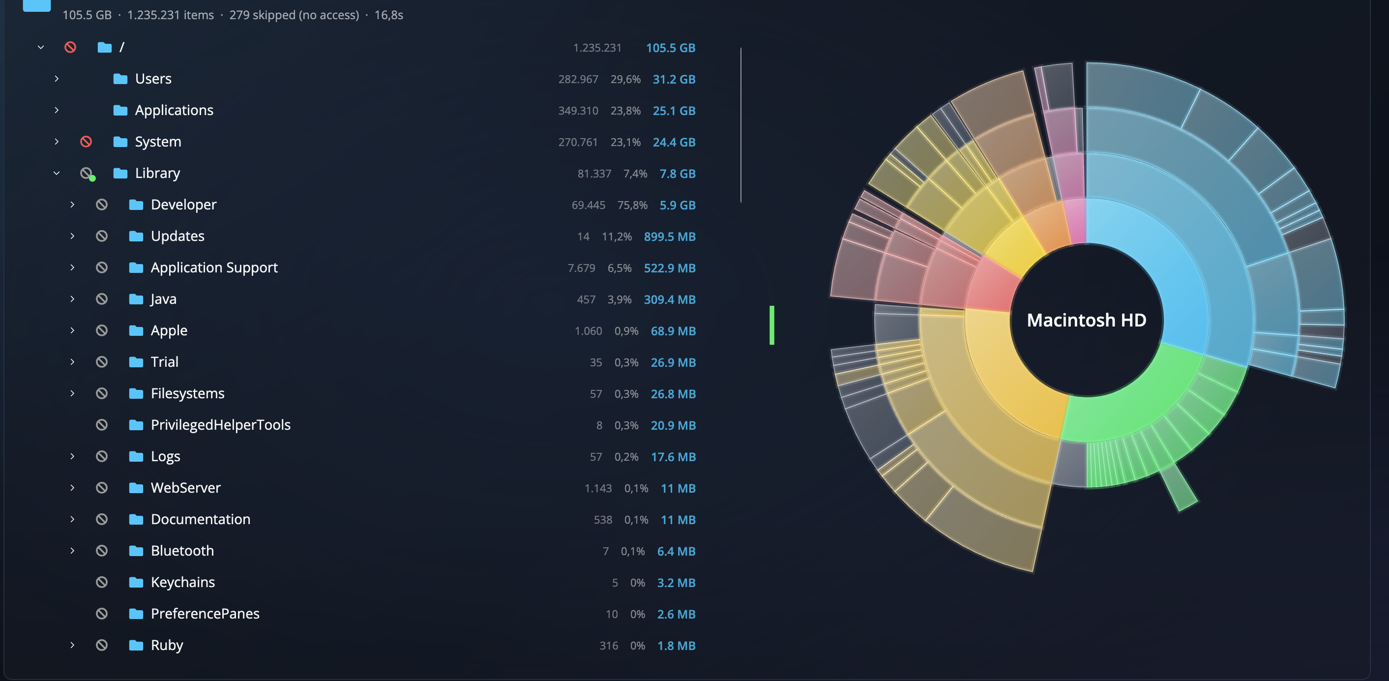
The tree
The tree shows folders only — it's how you find your way around, not where you pick things to delete. Each row is sorted biggest-first, with its item count, share of the scan, and size on the right. Click a folder to select it; its contents open in the panel beside the tree. A few things you'll notice:
- Colored markers in the leftmost gutter are the safety verdicts and locks; the full key is in Icons & colors. A small dot on a locked folder's marker means it's locked but holds something safe to clear — worth opening.
- An amber number on a folder counts how many items you've marked for removal inside it, wherever you've wandered since.
- Greyed rows are hidden folders (names starting with a dot). They're shown by default; you can hide them in Settings.
The contents panel
Selecting a folder in the tree opens its contents to the right — files and subfolders together, biggest-first, each with a checkbox. This is the one place you mark things for deleting or moving. On protected items the checkbox is disabled; hover it and a tooltip explains why. At the foot of the panel it tells you how many items it isn't showing — hidden files, and files that live only in the cloud — so "Select all" never quietly means "all except the ones you can't see".
Narrow window? The tree and panel share one sliding strip. Selecting a folder slides across to the panel; the and chevrons in the headers move between them, and the divider by the chart resizes the pair.
The sunburst chart
The rings read from the inside out: the center is the folder you scanned, the first ring is its folders and files, the next ring is what's inside those, and so on. The bigger the slice, the more space it takes.
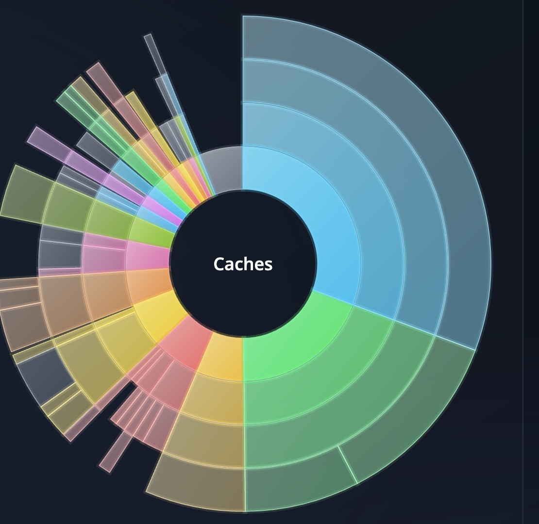
Clicking a slice zooms the sunburst and takes you there: click a folder and the panel lists its contents; click a file and Disk Space opens the folder holding it and highlights that row. Clicking a row in the panel does the reverse — highlights it and zooms the chart to it. Packages like .app bundles and photo libraries draw as one solid slice, since they're treated as single items throughout. The tooltip on the folder title above the tree offers "Back to the whole scan", which resets the zoom.
The details card
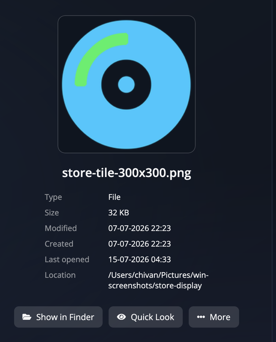
Click a file in the panel and the chart makes way for a details card: a preview thumbnail where available, plus the name, type, size, when it was modified, created and last opened, and where it lives. Buttons on the card let you Show in Finder (Explorer on Windows), open a Quick Look preview for files (macOS), or open the More menu with the same actions as the right-click menu. Click the folder in the tree again to put the chart back.
Below the chart: the verdict card
When a folder is selected, the card under the chart tells you what that folder is for and whether its contents are safe to remove. That card is the heart of the app's safety system, so read Safety verdicts & bans next.
Need more room for the tree? Drag the green divider between the tree and the chart to resize the two halves.
Didn't find your answer?
We're happy to help. Open a ticket and we'll get back to you.