Charts & dashboards
Turn your entries into simple visuals (bars, lines, and slices) so a stack of answers becomes a picture you can read at a glance.
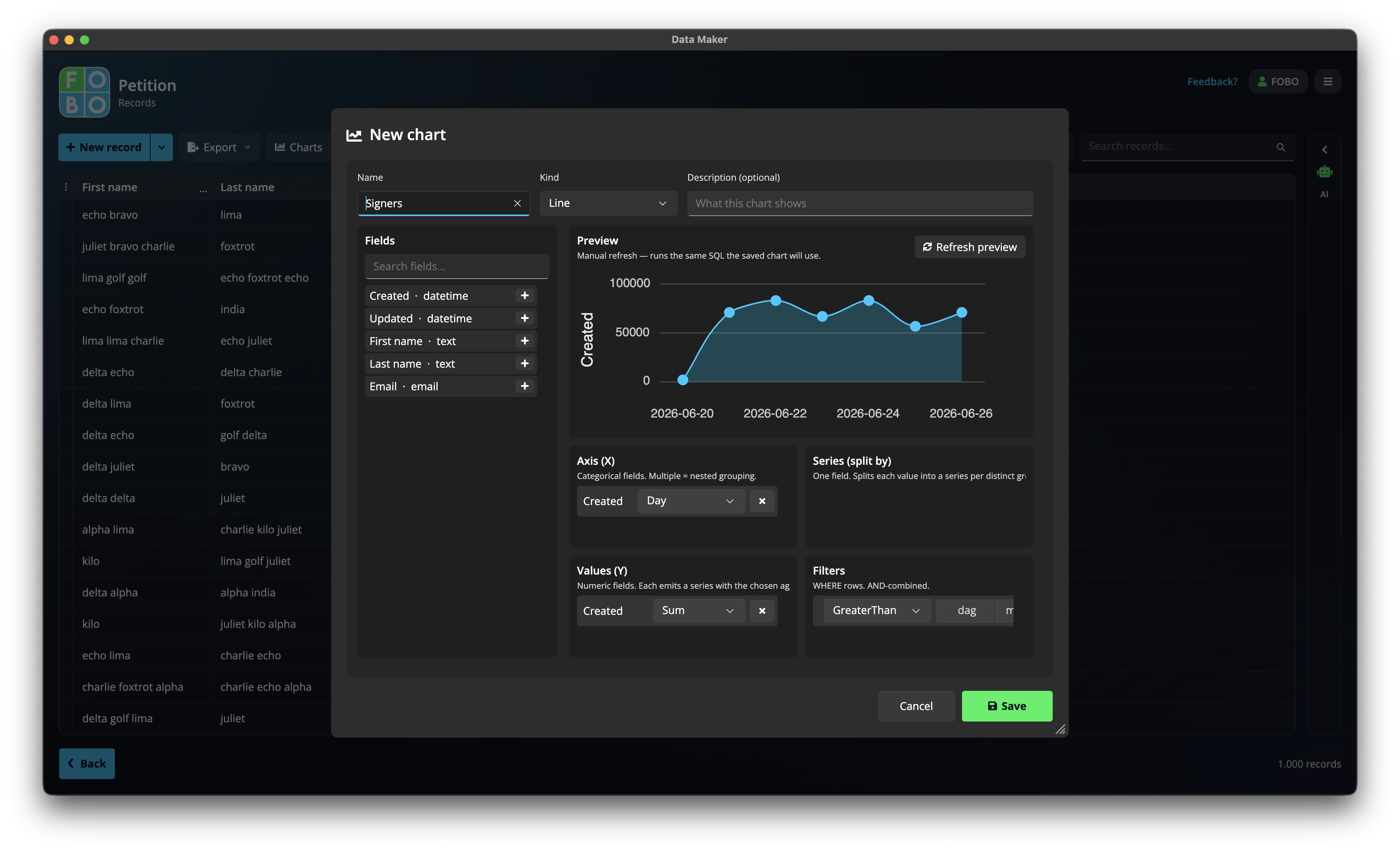
Numbers in a table tell a story, but a picture tells it faster. The Charts menu on the Records list lets you build a chart from your entries, say a bar chart showing how many responses came in each month.
Building a chart
Building a chart is a bit like arranging a few questions onto a stage and watching the picture appear:
- Pick a chart type: choose the shape that fits, such as bars for comparing amounts, a line for change over time, or a pie for slices of a whole.
- Set what goes across the bottom: drag a question onto the bottom of the chart. In a "responses per month" chart, that's the month each entry came in.
- Set what's grouped or coloured: drag another question here to split each bar into coloured parts, for example by team or by choice. This step is optional.
- Set what's measured: drag the question whose values you want to count or add up, the thing the height of each bar represents.
- Watch the live preview: as you drag questions in, the chart updates in front of you, so you can try arrangements until it looks right.
- Save it: when you're happy, give the chart a name and save it so you can come back to it.
A good first chart is a bar chart of responses per month: put the month across the bottom and count the entries. One glance tells you which months were busy.
Coming back to a saved chart
Your saved charts are waiting for you whenever you need them. You can:
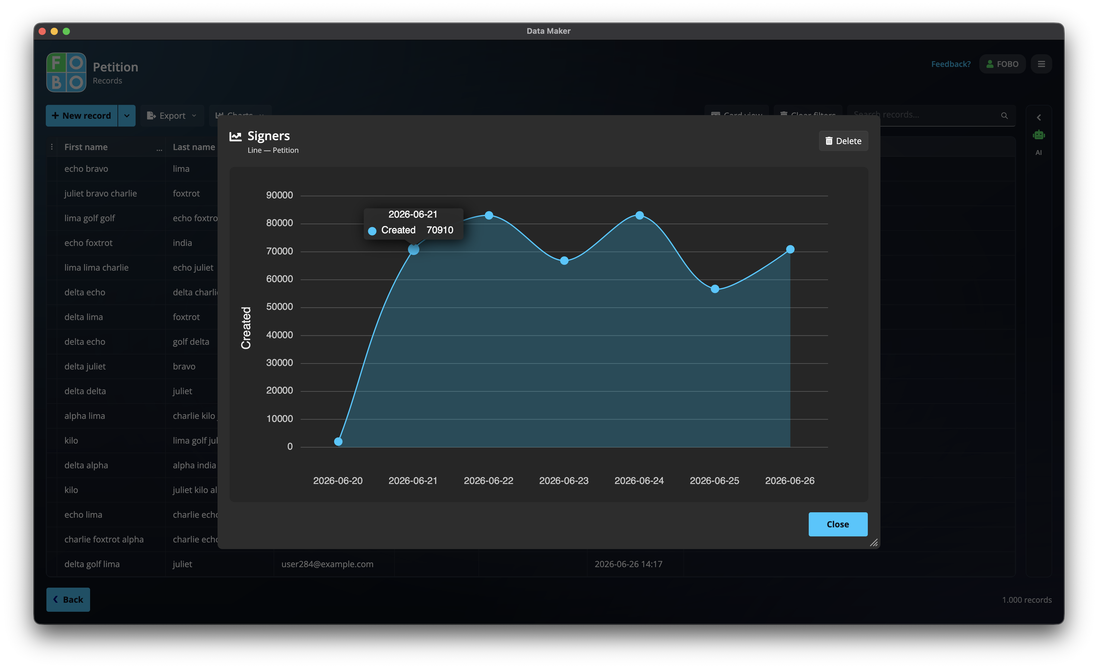
- View a chart again to see it with your latest entries; it always reflects what's in your Records list now.
- Delete a chart you no longer need.
- Add it to your Home dashboard as a tile, so it greets you the moment you open the app. See the Home dashboard.
Charts simply read your entries; building or viewing one never changes a thing in your Records list.
Didn't find your answer?
We're happy to help. Open a ticket and we'll get back to you.